Table of Contents
The truth is, your walls occupy more visual real estate than any other element in your living room. Choose the wrong wall treatment, and even the most expensive furniture will fall flat. Get it right, and you create a foundation that elevates everything else in the space. Whether you’re working with a compact urban apartment or a sprawling suburban home, the wall design you select will fundamentally shape how your living room looks, feels, and functions.
This comprehensive guide examines seven distinct modern living room wall design approaches that are defining interiors in 2025. We’ll go beyond surface-level aesthetics to explore the practical realities of each option—from installation costs and maintenance requirements to how different designs perform in various room sizes and lighting conditions. You’ll discover which contemporary wall treatments deliver maximum visual impact on modest budgets, which options offer timeless appeal that won’t feel dated in five years, and how to match wall design choices to your specific lifestyle needs.
By the end of this guide, you’ll have a clear framework for making confident decisions about your living room walls, backed by real-world cost breakdowns, professional implementation tips, and honest assessments of what works where. Let’s dive into the modern accent wall ideas and textured wall designs that are transforming living spaces right now.
7 Modern Wall Design Types: Complete Analysis
1. Accent Walls: The Strategic Focus Point
An accent wall remains one of the most popular modern living room wall design strategies for good reason—it allows you to introduce bold color, texture, or pattern without overwhelming the space. In 2025, accent walls have evolved far beyond the single painted wall approach. Today’s most compelling accent walls combine materials, play with geometric shapes, or create architectural depth where none existed.
The modern application of accent walls centers on creating intentional focal points. Rather than randomly selecting a wall to paint a different color, successful accent walls work with your room’s natural architecture. The wall behind your sofa, the surface flanking a fireplace, or the backdrop for your entertainment center all make logical choices because they already draw the eye.
Best Colors and Materials for 2025
Current interior wall design trends 2025 favor warm, grounding tones that create coziness without feeling heavy. Terracotta, deep sage green, warm charcoal, and rich navy continue to dominate modern accent wall ideas. These colors provide drama while maintaining versatility—they complement both warm wood tones and cool metal finishes.
Beyond paint, modern accent walls increasingly incorporate:
- Textured plaster finishes that catch light differently throughout the day, adding subtle dimension
- Large-format tile or stone extending from floor to ceiling for an architectural statement
- Reclaimed wood planks arranged in herringbone or horizontal patterns
- Fabric panels or upholstered walls that introduce softness and acoustic benefits
- Metallic or reflective surfaces that bounce light in darker spaces
Step-by-Step Implementation Guide
- Identify your focal wall by considering sightlines when entering the room and natural gathering spots
- Test your choice using large paint samples or temporary material mock-ups to see how they interact with existing lighting
- Prepare the surface properly—fill holes, sand smooth, and prime if changing from dark to light colors
- Use quality materials appropriate for your chosen finish; premium paint for painted walls, proper adhesives for material applications
- Consider professional installation for complex materials like stone, tile, or precision woodwork
- Plan around electrical outlets and switches—relocating them can create cleaner lines for dramatic materials
Expert Tip: The 60-30-10 Rule Still Works
Professional designers apply this classic principle to accent walls: 60% dominant color (your other three walls), 30% secondary color (furniture and larger decor), and 10% accent color (your accent wall and accessories). This creates visual balance while allowing your accent wall to make a statement without creating chaos.
Cost Analysis
$200 – $5,000+
Budget breakdown for a typical 12’x10′ accent wall:
- Paint-only approach: $200-400 (DIY) including premium paint and supplies
- Peel-and-stick wallpaper: $300-600 (DIY) for quality designer options
- Wood planking: $800-2,500 (material costs $4-12/sq ft, plus installation $5-10/sq ft if hiring professional)
- Stone or tile: $1,500-5,000+ (material $8-25/sq ft, professional installation $15-30/sq ft)
- Upholstered panels: $1,200-3,500 (custom fabrication typically required)
✓ Pros
- Creates instant focal point without full room commitment
- Wide range of budget options from DIY to luxury
- Easy to update or change compared to full-room treatments
- Can visually enlarge or reshape room proportions
- Provides opportunity to experiment with bolder choices
✗ Cons
- Can feel dated if color trends shift dramatically
- May appear disconnected if not properly integrated with decor
- Some materials (stone, tile) become permanent commitments
- Requires careful furniture placement to avoid blocking
- Can make small rooms feel unbalanced if poorly executed
Real-World Example: A client recently transformed their narrow 10’x18′ living room using a deep charcoal accent wall behind their sectional sofa, paired with warm white on the remaining walls. The dark color visually pushed that wall back, making the room feel wider rather than narrower—a counterintuitive result that demonstrates how strategic accent walls manipulate spatial perception.
2. Textured Wall Designs: Adding Tactile Dimension
While color makes the first impression, texture creates lasting interest. Textured wall designs introduce a three-dimensional quality that flat paint simply cannot achieve, transforming walls into sculptural elements that interact dynamically with light throughout the day. In modern living rooms, texture serves both aesthetic and practical functions—it hides minor wall imperfections, adds acoustic dampening, and creates visual warmth even in minimalist color palettes.
Types of Textured Wall Treatments
3D Wall Panels represent the most popular textur approach in contemporary wall treatments. These modular panels—available in materials from MDF to eco-friendly bamboo—install in grid patterns or custom arrangements. Geometric designs like waves, hexagons, or abstract relief patterns create sophisticated shadows that shift as natural light moves across the room. Installation is typically DIY-friendly using construction adhesive, making this an accessible option for homeowners comfortable with precise measurement and leveling.
Venetian Plaster offers old-world elegance reimagined for modern spaces. This lime-based finish requires professional application but delivers unmatched depth and luminosity. Multiple thin layers build up subtle variations in tone and sheen, creating surfaces that appear to glow from within. Modern applications often use neutral tones—soft grays, warm whites, or subtle beiges—allowing the material’s inherent beauty to star rather than bold color.
Exposed Concrete or Concrete-Effect Finishes bring industrial edge to modern living rooms. True exposed concrete works only in specific architectural contexts, but concrete-effect coatings can be applied to standard drywall. These finishes range from smooth troweled looks to rough, organic textures. They pair particularly well with warm wood and natural fiber textiles, creating balanced interiors that feel both raw and refined.
Fabric Coverings introduce softness often missing in modern spaces. Stretched fabric panels or traditional fabric wallcoverings add warmth, improve acoustics, and offer endless pattern possibilities. Textured linens, subtle weaves, or even leather-like materials create upscale environments while providing practical sound absorption—valuable in open-concept homes where living rooms connect to kitchens or dining areas.
How Texture Adds Dimension to Modern Spaces
Texture succeeds in minimalist wall design contexts because it provides visual interest without pattern or color complexity. A room with monochromatic walls gains depth through textural variation—smooth painted surfaces adjacent to rough plaster, or flat walls contrasted with dimensional panels. This approach allows furniture and art to remain focal points while walls contribute subtle sophistication.
Light interaction amplifies textural impact. Positioned correctly, even modest texture creates dramatic shadow play. Consider how afternoon sun raking across 3D panels produces constantly shifting patterns, or how spotlights directed at Venetian plaster make surfaces appear to ripple. Professional designers often specify textured walls specifically to maximize these light-and-shadow effects.
Expert Tip: Sample Before Committing to Texture
Texture photographs poorly, so always view physical samples in your actual space before finalizing decisions. Request 12″x12″ samples of 3D panels, bring home plaster sample boards, or arrange to view completed installations. What appears subtle in a showroom may read as overly busy in your living room, and vice versa.
Installation Complexity and Timeline
Installation requirements vary dramatically:
- 3D panels: DIY-friendly for handy homeowners; 1-2 days for average living room
- Venetian plaster: Requires skilled professional; 3-5 days including drying time between coats
- Concrete effects: Professional recommended; 2-4 days depending on finish complexity
- Fabric wallcovering: Professional installation advised; 1-2 days for proper stretching and seaming
Maintenance Requirements
Textured surfaces demand different care than flat painted walls. 3D panels accumulate dust in crevices requiring regular vacuuming with brush attachments. Venetian plaster, while durable, may need occasional waxing to maintain sheen. Fabric coverings can trap odors in smoking households and require professional cleaning if stained. Exposed concrete finishes are remarkably low-maintenance but may need periodic resealing in high-humidity climates.
$500 – $6,000+
Cost expectations for textured treatments on a 12’x10′ wall:
- 3D MDF panels (DIY): $500-1,200
- 3D premium panels (installed): $1,500-3,000
- Venetian plaster (professional): $2,500-5,000
- Concrete-effect coating: $1,800-3,500
- Fabric wall covering: $1,200-4,000 depending on material quality
✓ Pros
- Creates sophisticated depth without pattern or color
- Hides minor wall imperfections effectively
- Provides acoustic benefits in many cases
- Interacts beautifully with changing natural light
- Works within minimalist and maximalist aesthetics
✗ Cons
- More difficult to change than paint
- Requires specialized cleaning and maintenance
- Can make rooms feel smaller if texture is too heavy
- Professional installation often necessary for best results
- Higher cost than traditional painted finishes
3. Minimalist Monochromatic Approach: The Power of Simplicity
In an era of visual overstimulation, minimalist wall design offers calm, clarity, and timeless sophistication. This approach strips walls to their essential function—creating clean backdrops that allow architecture, furnishings, and occupants to take center stage. Don’t mistake minimalism for boring; executed well, monochromatic walls demonstrate remarkable nuance and intentionality.
Color Psychology in Modern Design
Choosing the “right” white, gray, or beige proves far more complex than selecting from paint chips. Color perception shifts dramatically based on natural light direction, artificial lighting quality, and surrounding materials. North-facing rooms with cool light require warm-toned neutrals to avoid feeling sterile. South-facing spaces can handle cooler grays without appearing cold.
Current favorites among designers include:
- Warm whites with subtle cream undertones that feel inviting rather than clinical
- Soft greiges (gray-beige hybrids) that bridge warm and cool elements in furniture and flooring
- Pale, dusty grays with blue or green undertones for contemporary sophistication
- Barely-there blush or sand tones that read as neutral but add warmth
The key is testing paint in your specific space. Purchase sample pots and paint large swatches on multiple walls. Observe how colors shift from morning to evening, and how they appear under both natural and artificial light. Colors that seem perfect in a store often reveal unexpected undertones once home.
Creating Depth Without Color Variation
Monochromatic doesn’t mean monotonous. Professional designers create visual interest through:
Layered sheen variations: Using flat paint on ceilings, eggshell on walls, and semi-gloss on trim creates subtle differentiation within the same color family. Light reflects differently off each surface, producing dimensional effects without introducing new colors.
Architectural details: Crown molding, picture rails, wainscoting, or simple horizontal trim lines break up expansive wall surfaces. When painted the same color as walls but in contrasting sheens, these elements add sophistication without visual noise.
Lighting design: Wall-washing techniques, picture lights, and uplighting gain prominence in monochromatic spaces. Light becomes a design element, creating gradients and highlights that animate neutral walls throughout the day.
Best Paint Finishes: Matte vs. Satin vs. Gloss
Matte/Flat finishes hide wall imperfections most effectively and create sophisticated, velvety surfaces. However, they mark easily and prove difficult to clean, making them poor choices for high-traffic living rooms or homes with children and pets.
Eggshell/Satin finishes strike the optimal balance for most living rooms. They offer subtle sheen that reflects just enough light to enliven walls while remaining washable. These finishes conceal minor imperfections while standing up to daily life.
Semi-gloss finishes work best as accents on trim, doors, or architectural details. Some designers use them on entire walls in dining rooms or powder rooms, but they highlight every wall imperfection in larger living spaces.
Expert Tip: The Two-Shade Strategy
Instead of true monochrome, consider using two shades from the same color card—perhaps numbers 2 and 4 in a fan deck. The barely perceptible difference creates subtle dimension while maintaining cohesion. Try the lighter shade on three walls and the slightly darker tone on your focal wall, or use the darker shade on lower walls with the lighter one above a picture rail.
Furniture Pairing Recommendations
Minimalist walls require intentional furniture selection. Without color or pattern on walls, furniture becomes the primary visual interest. This approach works brilliantly when you invest in statement pieces—a sculptural sofa, unique coffee table, or dramatic lighting fixtures.
Key principles:
- Vary furniture textures: Combine smooth leather, nubby linen, soft velvet, and raw wood to create richness
- Embrace negative space: Don’t fill every wall or corner; emptiness reads as luxury in minimalist spaces
- Invest in quality over quantity: One excellent piece outperforms three mediocre ones against neutral walls
- Layer in natural materials: Wood, stone, metal, and plants provide organic variation that prevents sterility
$300 – $800
Budget expectations for professional results in an average living room:
- Premium paint and supplies: $200-400 (DIY approach)
- Professional painting: $500-800 including preparation, primer, and two coats
- Architectural trim addition: $400-1,200 if installing new molding or wainscoting
✓ Pros
- Timeless aesthetic that won’t feel dated
- Creates calm, sophisticated atmosphere
- Allows furniture and art to be true focal points
- Easy to refresh by simply repainting same color
- Most budget-friendly option when DIYing
- Broad appeal for resale purposes
✗ Cons
- Can feel bland without thoughtful furniture and lighting
- Shows scuffs and marks more readily on light colors
- Requires higher quality paint for premium look
- May lack personality for those wanting bold statements
- Can appear sterile in poorly lit spaces
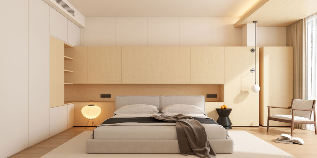
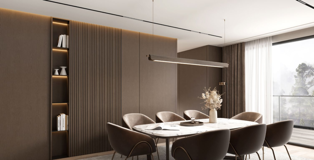
4. Wood Paneling & Natural Materials: Warmth Meets Modernity
Few materials bring the inherent warmth and organic beauty of wood to interior spaces. The wood panel wall living room concept has evolved dramatically from dark, dated paneling of decades past. Today’s wood wall treatments balance natural authenticity with clean-lined contemporary design, creating spaces that feel both grounded and current.
Modern vs. Traditional Wood Paneling
Traditional wood paneling evokes thoughts of 1970s rec rooms—dark, heavy, and overwhelming. Modern wood wall applications flip this script entirely. Instead of covering entire rooms in dark-stained panels, contemporary approaches use wood strategically as an accent material, celebrate natural wood tones, and prioritize clean installation methods that showcase wood’s grain and texture.
Modern applications include:
- Wide plank walls: Full-height boards (often 6-8″ wide) installed horizontally create linear flow and make rooms feel larger
- Vertical slat walls: Evenly spaced wood slats running floor-to-ceiling add height and contemporary rhythm
- Geometric wood patterns: Herringbone, chevron, or custom grid layouts add visual complexity
- Reclaimed wood feature walls: Weathered barn wood or repurposed timber introduces character and sustainability
- Charred wood (Shou Sugi Ban): Japanese technique creating dramatic dark surfaces with unique texture
Sustainable Material Options
Environmental consciousness increasingly influences material choices. Sustainable wood paneling options include:
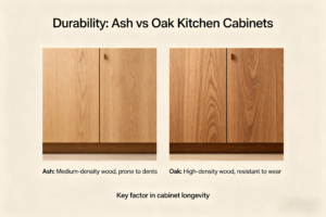
FSC-Certified hardwoods from responsibly managed forests ensure your design choices support forest health. Oak, ash, and maple remain popular for their beautiful grain and durability.
Reclaimed or salvaged wood gives new life to materials from demolished buildings, old barns, or deconstructed industrial spaces. Beyond environmental benefits, reclaimed wood offers unique patina and character impossible to replicate in new materials.
Engineered wood products like plywood or MDF with wood veneer provide stable, cost-effective alternatives to solid wood. Modern manufacturing produces stunning veneers that showcase wood grain beautifully while using materials more efficiently.
Bamboo grows rapidly, making it highly renewable. Modern bamboo panels offer contemporary aesthetics with excellent sustainability credentials.
Horizontal vs. Vertical Slat Designs
Orientation fundamentally affects spatial perception. Horizontal slats emphasize width, making rooms feel broader and more grounded. This works particularly well in smaller living rooms where you want to create the illusion of more space. Horizontal installation also tends to feel more casual and relaxed.
Vertical slats draw the eye upward, increasing perceived ceiling height. This orientation feels more formal and contemporary, working beautifully in rooms with lower ceilings or where you want to create architectural drama. Vertical installations also allow for creative spacing variations—tight groups interspersed with open sections can create rhythm and visual interest.
Expert Tip: Mind the Gap (Spacing)
For slat walls, spacing matters tremendously. Too tight (under 1″) reads as solid paneling without modern lightness. Too wide (over 3″) can look unfinished or create distracting stripes. Sweet spot: 1.5-2.5″ gaps for most applications. Test spacing options by temporarily mounting a few boards before committing to the entire wall.
Wood Tones That Work in 2025
Current preferences favor natural, lighter wood tones that brighten rather than darken spaces:
- White oak with natural/clear finish: Light, neutral, works with virtually any decor style
- Light walnut or natural walnut: Rich without being dark, adds warmth without overwhelm
- Ash with minimal stain: Pale gray undertones suit contemporary aesthetics
- Whitewashed or limed finishes: Any wood type treated to reveal grain while lightening color
- Warm mid-tones: Honey oak, natural pine with clear coat for Scandi-inspired spaces
Dark woods still have a place but require more careful integration. If using dark wood, balance it with plenty of white or light walls, generous natural light, and lighter flooring to prevent spaces from feeling cave-like.
$1,500 – $8,000+
Wood paneling costs vary significantly based on material quality and installation complexity:
- Pine or poplar boards (DIY): $1,500-2,500
- Oak or maple (DIY): $2,500-4,000
- Professional installation: Add $2,000-4,000 to material costs
- Reclaimed wood (material only): $3,000-6,000 depending on quality and patina
- Custom shou sugi ban or specialty finishes: $5,000-8,000+ professionally executed
✓ Pros
- Introduces natural warmth and organic texture
- Exceptional durability when properly installed
- Adds significant perceived value to homes
- Can provide acoustic benefits
- Works across design styles from rustic to ultra-modern
- Sustainable options available
✗ Cons
- Higher cost than most other wall treatments
- Installation typically requires professional skills
- Can darken spaces if not balanced properly
- Wood requires maintenance (occasional cleaning, possible refinishing)
- May not suit all design preferences
- Difficult to remove once installed
5. Gallery Walls & Art-Focused Designs: Curated Personal Expression
When walls serve primarily as canvases for displaying art and personal collections, the wall treatment itself takes a supporting role. This approach transforms living rooms into personal galleries, where curated collections tell stories and reflect individual taste. Gallery walls suit art lovers, collectors, and anyone wanting to showcase photography, prints, or meaningful objects.
Modern Gallery Wall Layouts
Gone are the days of rigidly symmetrical arrangements. Modern living room wall decor embraces more organic, salon-style layouts that feel collected over time rather than purchased in matching sets.
Popular contemporary layouts include:
The Grid: Multiple same-size frames arranged in perfect rows and columns creates clean, contemporary impact. This works beautifully with photography series or consistent artwork. The uniformity feels intentional and modern.
Salon Style: Varying frame sizes and art types create dynamic, collected-over-time feeling. Start with largest piece slightly off-center, build outward maintaining roughly equal spacing between all frames (typically 2-3 inches). This approach allows for growth—add new pieces as you discover them.
The Statement Piece Plus: One large artwork anchors the wall with smaller pieces clustered nearby or arranged asymmetrically to one side. This maintains focus on your most important piece while creating surrounding interest.
Horizontal Line: Frames of varying heights aligned along a common bottom or top edge create contemporary flow. This works especially well above sofas or console tables, where you want visual weight without overwhelming the space.
Frame Selection and Spacing Guidelines
Frame consistency creates cohesion even with varied artwork. Professional approaches include:
- Single frame color: All black, all white, or all natural wood unifies disparate artwork
- Single frame style: All simple profiles or all ornate, but in varying colors and finishes
- Mat board consistency: Using the same mat color (typically white or cream) creates visual calm
- Intentional variety: Mixing frames works when you establish another unifying element (all vintage frames, all minimalist profiles, etc.)
Spacing determines whether your gallery feels calm or chaotic. Maintain 2-3 inches between frames for salon-style arrangements. Tighter spacing (1-1.5 inches) suits grid layouts. Wider gaps (4+ inches) work only when each piece can stand alone visually.
Expert Tip: Plan on Paper First
Before hammering a single nail, trace each frame on kraft paper, cut out the shapes, and arrange them on your wall using painter’s tape. This lets you experiment with layouts risk-free. Mark nail positions on the paper templates, then nail through the paper into the wall before removing it—guaranteed perfect placement every time.
Wall Color Recommendations
Gallery walls perform best against neutral backgrounds that don’t compete with artwork. Ideal choices include:
- Crisp white: Museum-quality backdrop that makes colors in artwork pop
- Soft gray: Provides subtle contrast without the starkness of pure white
- Warm greige: Adds warmth while remaining neutral enough for varied art
- Deep charcoal or navy: Bold choice that makes white mats and lighter artwork dramatic
Avoid busy wallpapers or bold paint colors on gallery walls unless you want wall treatment and art to create intentional visual tension. In most cases, walls should recede, allowing art to shine.
Budget-Friendly Art Alternatives
Building meaningful art collections takes time and investment, but compelling gallery walls don’t require expensive originals:
- Museum-quality prints: Many museums offer affordable reproduction prints of masterworks
- Online printable art: Digital downloads you print locally offer thousands of options at minimal cost
- Your own photography: Frame favorite travel photos, nature shots, or abstract images for personal meaning
- Vintage finds: Thrift stores, estate sales, and online marketplaces offer unique pieces with character
- Mixed media: Incorporate mirrors, shelves displaying objects, or decorative plates among framed art
$400 – $3,000+
Gallery wall investment depends entirely on art and framing choices:
- Budget approach: $400-800 for printable art, ready-made frames, DIY installation
- Mid-range investment: $1,000-2,000 for quality prints or originals, custom framing
- Collector approach: $3,000+ for original artwork, professional framing and installation
✓ Pros
- Highly personal and customizable to your taste
- Can start small and build over time
- Easy to refresh by swapping out pieces
- Creates conversation-starting focal point
- Suits renters—no permanent wall changes required
- Budget-friendly options available
✗ Cons
- Requires careful planning to avoid cluttered appearance
- Can be time-intensive to curate and install properly
- May not suit minimalist preferences
- Needs regular dusting and maintenance
- Can feel overwhelming in small spaces
- Quality custom framing adds significant cost
6. Geometric & Patterned Wallpaper: Bold Pattern Play
Wallpaper has experienced a remarkable renaissance, evolving from outdated floral motifs to sophisticated geometric designs that define contemporary interiors. Modern wallpaper offers pattern impact without the permanence concerns of the past, thanks to removable options that install and remove easily—perfect for renters and commitment-wary homeowners alike.
Current Wallpaper Trends for 2025
Interior wall design trends 2025 favor geometrics that create movement and energy without overwhelming spaces. Leading patterns include:
Linear geometrics: Simple lines, grids, or hexagons in tone-on-tone colorways add subtle texture and pattern without distraction. These work beautifully as full-room treatments or accent walls.
Organic shapes: Abstract curves, modern florals reduced to essential forms, and nature-inspired patterns that feel contemporary rather than traditional. Think oversized monstera leaves rendered in unexpected colors, or abstract wave patterns in neutral palettes.
Textural looks: Grasscloth-effect, linen weave, or faux materials like concrete and marble provide pattern through texture rather than printed design. These add sophistication while reading as neutral from a distance.
Maximalist statements: For bold personalities, large-scale murals, dramatic tropical prints, or graphic black-and-white patterns create showstopping focal walls. These require confidence but deliver unforgettable impact.
Metallic accents: Wallpapers incorporating gold, copper, or silver details catch light and add luxury. Modern applications use metallic sparingly as accents within larger geometric or abstract patterns.
Peel-and-Stick vs. Traditional Wallpaper
Peel-and-stick wallpaper revolutionized the market for renters and DIYers. Advantages include:
- No paste or special tools required—install with basic smoothing tools
- Repositionable during installation if you make mistakes
- Removable without wall damage (typically) when you want a change
- Perfect for renters or those who update frequently
Limitations include slightly lower durability, visible seams in some products, and texture that may not match traditional wallpaper’s quality. However, premium peel-and-stick options now rival traditional wallpaper in appearance.
Traditional paste wallpaper remains superior for:
- Long-term installations where you want maximum durability
- High-end designs with specialty finishes (grasscloth, metallics, hand-painted)
- Seamless installations in large rooms where peel-and-stick seams might be visible
- Textured or heavyweight papers that don’t work with adhesive backing
Pattern Selection for Different Room Sizes
Pattern scale dramatically affects spatial perception. Guidelines for selecting appropriate patterns:
Small rooms (under 150 sq ft): Choose small- to medium-scale patterns in light colors. Large patterns can overwhelm, making spaces feel even smaller. Vertical patterns add height; horizontal patterns add width. Stick to one accent wall unless using very subtle patterns.
Medium rooms (150-250 sq ft): Medium-scale patterns work well, either as full-room treatments or accent walls. You have flexibility to experiment with bolder colors while maintaining visual balance.
Large rooms (250+ sq ft): Large-scale patterns shine here. Oversized geometrics, dramatic murals, or statement prints fill space without becoming repetitive. You can also successfully wallpaper multiple walls or the entire room in pattern.
Expert Tip: Order Extra for Pattern Matching
Always order 15-20% more wallpaper than measurements suggest. Pattern matching wastes material, and you’ll want extra for future repairs. Nothing’s worse than a discontinued pattern with a damaged section you can’t replace. Store leftover rolls vertically in cool, dry locations.
Installation Tips
Professional results require preparation:
- Prepare walls properly: Fill holes, sand smooth, clean thoroughly. Wallpaper highlights imperfections rather than hiding them.
- Prime if needed: Especially important over dark paint or on new drywall. Primer ensures better adhesion and easier future removal.
- Plan pattern placement: Center dominant patterns on focal walls. Plan where patterns meet in corners to minimize awkward breaks.
- Use proper tools: Smoothing tools, sharp blades, level, and straight edge are essential for professional results.
- Work methodically: Start at room corners or behind doors where mistakes are less visible. Take time with each strip before moving to the next.
$400 – $2,500+
Wallpaper costs per 120 sq ft (average living room accent wall):
- Budget peel-and-stick (DIY): $400-700
- Mid-range peel-and-stick (DIY): $700-1,200
- Designer traditional (DIY): $800-1,500
- Designer traditional (professional installation): $1,500-2,500
- Specialty finishes (grasscloth, metallics, hand-painted): $2,000-4,000+
✓ Pros
- Delivers maximum pattern impact efficiently
- Modern removable options reduce commitment concerns
- Endless design possibilities for any aesthetic
- Can visually alter room proportions with pattern choice
- Premium wallpapers add luxury details paint can’t match
- DIY-friendly with peel-and-stick options
✗ Cons
- Can feel dated as pattern trends shift
- More expensive than paint for equivalent coverage
- Installation requires precision and patience
- Pattern matching increases material waste
- Bold patterns may tire quickly in high-use spaces
- Removal can be labor-intensive (traditional wallpaper)
7. Mixed Materials & Hybrid Approaches: The Art of Combination
The most sophisticated contemporary wall treatments often combine multiple approaches, layering materials and techniques to create truly custom environments. Mixed material walls demonstrate design confidence, blending textures, colors, and patterns in ways that feel intentional rather than chaotic. This approach requires careful planning but delivers personalized results impossible to achieve with single-material treatments.
Successful Material Combinations
Certain material pairings create natural harmony:
Wood + Paint: Wood wainscoting or lower panels topped with painted upper walls creates classic proportion with modern sensibility. Use natural wood tones below with soft whites or grays above, or paint wood the same color as walls but in different sheens for subtle contrast.
Texture + Smooth: Textured plaster or 3D panels on one wall with smooth painted walls elsewhere balances interest with calm. The textured wall becomes a focal point while smooth walls provide visual rest.
Pattern + Solid: Wallpaper on one accent wall with complementary solid-color paint on remaining walls offers pattern impact without overwhelm. Extract a color from your wallpaper pattern to use on other walls for cohesion.
Mixed textures: Combining rough and smooth within single walls—exposed brick sections adjacent to smooth plaster, or wood panels interspersed with painted drywall—adds depth and architectural interest.
Upper/lower splits: Different materials or colors above and below a chair rail or mid-wall line creates visual interest while grounding spaces. Dark below/light above is traditional; reversing this (light below/dark above) feels contemporary.
How to Balance Different Textures
Successfully combining materials requires restraint and intentionality:
Limit your palette: Even when using multiple materials, stick to 2-3 colors maximum. Materials should vary in texture but relate in tone. For example: natural wood, cream paint, and gray-beige textured panels share neutral warmth despite being different materials.
Establish hierarchy: One material should dominate (60-70% of visual weight), another supports (20-30%), and the third acts as accent (10-15% max). This creates balance rather than competition.
Consider scale: Mix fine and coarse textures for interest. Smooth painted walls balance chunky wood planks; delicate wallpaper patterns offset rough concrete effects.
Create clear transitions: Where materials meet, use crisp lines rather than blurred edges. Clean junctions between materials look intentional; fuzzy transitions appear unfinished.
Expert Tip: Sample Combinations in Situ
Before committing to mixed materials, create a physical mockup corner in your actual space. Paint a large board in your chosen color, prop wood samples against it, and position wallpaper samples nearby. Live with this arrangement for several days, observing how materials interact under different lighting. What seems balanced in a showroom may feel chaotic (or too subtle) in your home.
Avoiding Design Chaos
Mixed materials can quickly become overwhelming. Red flags to avoid:
- Too many patterns: If using patterned wallpaper, keep other surfaces solid
- Competing focal points: Each wall shouldn’t demand equal attention; establish one primary focus
- Unrelated color schemes: Materials should share undertones (all warm or all cool)
- Inconsistent style: Mixing rustic reclaimed wood with ultra-modern metallic wallpaper requires expert skill; beginners should combine materials within the same style family
- Overcrowding: Leave some walls simple to provide visual rest
Professional Tips for Cohesion
Designers use these techniques to unify mixed-material spaces:
- Repeat elements: If using wood on walls, echo it in furniture, ceiling beams, or flooring
- Create flow: Use the same or related materials in adjacent rooms for visual continuity
- Layer thoughtfully: Start with largest elements (paint color, dominant material), then add layers (texture, pattern, accents) incrementally
- Test with existing elements: Your mixed materials must work with existing flooring, furniture, and fixtures—not just each other
$1,200 – $6,000+
Mixed material costs depend entirely on chosen combinations:
- Paint + wallpaper combination: $1,200-2,000
- Paint + wood paneling: $2,500-4,500
- Multiple premium materials (wood + texture + paint): $4,000-6,000+
- Custom mixed-media walls: $5,000-10,000+ for complex professional installations
✓ Pros
- Creates truly custom, one-of-a-kind environments
- Allows expression of complex design visions
- Adds architectural interest to plain rooms
- Can incorporate budget and luxury materials together
- Provides flexibility to evolve design over time
✗ Cons
- Requires strong design sense to execute successfully
- More expensive than single-material approaches
- Higher risk of creating visual chaos
- Complex to change or update later
- May narrow potential buyer appeal for resale
- Can overwhelm smaller spaces if not carefully planned
How to Choose the Right Wall Design for Your Living Room
With seven distinct approaches to modern living room wall design, selecting the right option requires evaluating multiple factors specific to your space, budget, and lifestyle. This decision framework helps you navigate choices systematically.
Room Size Considerations
Small Living Rooms (Under 150 sq ft): Prioritize designs that enhance spaciousness rather than overwhelming limited square footage. Your best options include minimalist monochromatic approaches in light colors, subtle textured finishes that add interest without visual weight, or strategic accent walls in colors that recede (deep blues, soft grays) to push walls back. Avoid large-scale patterns, dark wood paneling on multiple walls, or busy gallery walls that can make small rooms feel cluttered.
Medium Living Rooms (150-250 sq ft): You have the most flexibility here. Nearly any option works if executed thoughtfully. Consider your natural focal point—fireplace, large windows, entertainment center—and design around it. This size accommodates accent walls beautifully, allows for wood paneling without overwhelm, and can handle patterned wallpaper or curated gallery walls.
Large Living Rooms (250+ sq ft): Large spaces risk feeling empty or disconnected without sufficient visual interest. Mixed material approaches work brilliantly, creating zones within open areas. Large-scale wallpaper patterns that would overwhelm smaller spaces shine here. Wood paneling can cover multiple walls without feeling heavy. Consider using different wall treatments to define distinct areas within the larger room—entertainment zone, reading nook, conversation area.
Natural Lighting Factors
Light quality fundamentally affects how wall colors and materials appear:
North-facing rooms receive cool, indirect light. Combat potential coldness with warm wall colors (creams, warm grays, terracotta), natural wood in honey or walnut tones, or textured surfaces that create dimensional shadows. Avoid stark white or cool grays that can feel sterile.
South-facing rooms enjoy warm, consistent light throughout the day. You can use cooler wall colors (soft blues, true grays, crisp whites) without spaces feeling cold. This orientation showcases textured walls beautifully as shadows shift with the sun. Bold accent walls in dark colors work particularly well with abundant natural light.
East-facing rooms have morning sun, cooler afternoon light. Choose adaptable neutrals that look good under varying conditions. Test paint samples at different times of day.
West-facing rooms feature warm afternoon and evening light. Similar to south-facing spaces, they handle cooler tones well. Evening light makes warm wood tones glow beautifully.
Quick Decision Matrix
Step 1: Are you working with a small room (under 150 sq ft)?
→ YES: Consider minimalist paint, light accent walls, or subtle texture
→ NO: Continue to Step 2
Step 2: What’s your realistic budget for this project?
→ Under $500: DIY paint (monochromatic or accent wall)
→ $500-$1,500: Peel-and-stick wallpaper or 3D panels (DIY)
→ $1,500-$3,000: Wood paneling, professional wallpaper, or Venetian plaster
→ $3,000+: Mixed materials, custom solutions, high-end finishes
Step 3: How long do you plan to keep this design?
→ 1-2 years (renter or frequent updater): Removable wallpaper or paint
→ 3-5 years: Any option works, but consider trend longevity
→ 5+ years: Invest in timeless choices like quality wood, classic neutrals, or gallery walls you can evolve
Step 4: What’s your maintenance tolerance?
→ Low (minimal upkeep): Painted walls in eggshell finish, gallery walls
→ Medium: Wood paneling, peel-and-stick wallpaper, 3D panels
→ Higher (willing to maintain): Venetian plaster, traditional wallpaper, fabric coverings
Step 5: What’s your design personality?
→ Minimalist/serene: Monochromatic paint, subtle texture, light wood
→ Bold/expressive: Accent walls, dramatic wallpaper, mixed materials
→ Personal/collected: Gallery walls, mixed vintage finds
→ Natural/organic: Wood paneling, textured plaster, earth tones
Budget Planning with Specific Price Ranges
| Design Type | DIY Cost | Professional Cost | Best Value Tier |
|---|---|---|---|
| Minimalist Paint | $300-500 | $600-900 | Budget |
| Painted Accent Wall | $200-400 | $500-800 | Budget |
| 3D Panels | $500-1,200 | $1,500-3,000 | Mid-Range |
| Peel-and-Stick Wallpaper | $400-1,200 | $800-1,800 | Mid-Range |
| Wood Paneling | $1,500-4,000 | $3,500-8,000 | Investment |
| Venetian Plaster | Not Recommended | $2,500-5,000 | Investment |
| Gallery Wall | $400-2,000 | $1,500-4,000 | Varies |
Lifestyle Compatibility
Families with young children: Choose durable, washable options. Eggshell or satin paint finishes clean easily. Avoid delicate wallpapers or light-colored fabric coverings. Wood paneling actually performs well—it’s damage-resistant and hides marks better than painted drywall.
Pet owners: Similar to families with children, prioritize washability and durability. Avoid fabric wall coverings that trap pet hair. Textured surfaces can be harder to clean thoroughly. Smooth painted walls in darker or mid-tone colors hide scuffs from pets brushing against them.
Renters: Focus on non-permanent options. Peel-and-stick wallpaper, gallery walls, and painted accent walls (with landlord permission) all work. Avoid wood paneling, tile, or any installation requiring significant wall modification.
Frequent entertainers: Create visual impact with accent walls, statement wallpaper, or gallery walls that spark conversation. Ensure durability to withstand occasional bumps from gatherings.
ROI and Property Value Impact
Not all wall designs affect resale value equally:
Positive impact options: Quality wood paneling, professionally executed Venetian plaster, and timeless neutral paint colors appeal to buyers and can increase perceived home value. These investments often return 60-80% of costs upon sale.
Neutral impact options: Gallery walls (removed before listing), peel-and-stick wallpaper (removed before listing), and well-chosen accent walls neither help nor hurt sales. They’re for your enjoyment rather than investment.
Potentially negative impact: Very bold permanent choices (dramatic traditional wallpaper, unusual color combinations, extreme design statements) may narrow your buyer pool. If selling within 3-5 years, stick to more universal options.
Trend Longevity vs. Timeless Choices
Timeless options that remain appealing across decades:
- Neutral painted walls in quality finishes
- Natural wood paneling in classic tones
- Simple white or cream walls with architectural trim
- Carefully curated gallery walls (because you can update contents)
Trend-forward options that may date within 5-10 years:
- Specific geometric wallpaper patterns popular now
- Trendy accent wall colors (current favorites will shift)
- Ultra-specific material combinations (very of-the-moment mixed materials)
- Specialty finishes like shou sugi ban (unless executed classically)
“The best wall design isn’t about following the latest trend—it’s about creating a backdrop that supports how you actually live in your space. A well-chosen wall treatment should feel like it was always meant to be there, enhancing your daily life rather than demanding constant attention.”
Final Recommendations: Finding Your Perfect Match
After examining seven comprehensive approaches to modern living room wall design, the real answer to “which is best?” depends entirely on your unique combination of space, budget, style, and lifestyle. However, clear winners emerge for specific scenarios.
Best for Small Rooms
Winner: Minimalist Monochromatic in Light Tones
Light, neutral walls maximize the sense of space while creating a sophisticated foundation for furniture and decor. If you need more interest, add a single subtle textured accent wall—but keep colors in the same light family. Small rooms need breathing room, and minimal wall treatments provide exactly that.
Best for Budget-Conscious Homeowners
Winner: DIY Painted Accent Wall
For $200-400 in materials, a well-executed accent wall transforms entire spaces. Choose a current color, use quality paint, and take time with proper preparation. The return on investment in terms of visual impact far exceeds the modest cost. Peel-and-stick wallpaper offers a close second if you’re comfortable spending slightly more ($400-600).
Best for Maximum Impact
Winner: Mixed Materials (Wood + Paint or Texture + Paint)
Nothing creates more dramatic transformation than thoughtfully combined materials. A wood-paneled accent wall paired with complementary painted surfaces, or textured plaster on one wall with smooth paint elsewhere, delivers custom-designed sophistication impossible to achieve with single materials. The investment is significant ($2,500-6,000+) but the result feels truly special.
Best for Timeless Appeal
Winner: Natural Wood Paneling in Classic Tones
Quality wood installed professionally will look as good in 20 years as it does today. Choose natural or lightly finished woods in horizontal or vertical applications that complement your architecture. While the upfront cost is substantial ($3,000-8,000), this represents a true investment that adds lasting value and never feels dated.
The Path Forward
Your journey toward the perfect living room walls starts with honest assessment. Measure your space, establish a realistic budget including a 20% contingency for unexpected costs, and identify what matters most—whether that’s quick impact, long-term value, design flexibility, or personal expression.
Remember that walls don’t exist in isolation. The best wall design complements your existing architecture, works with your lighting conditions, and provides an appropriate backdrop for how you actually use your living room. A beautifully textured wall means little if it clashes with your beloved furniture or makes your already-dark room feel like a cave.
Ready to Transform Your Living Room?
Start small if you’re uncertain—paint samples cost less than $10 and trying multiple options on your walls reveals far more than any article can explain. Order wallpaper samples, visit showrooms to see textured finishes in person, and take time to live with your choices before committing.
The perfect wall design is the one that makes you smile every time you walk into your living room. Trust your instincts, invest in quality where it matters, and remember that few design decisions are truly permanent.
Looking ahead, modern living room wall design continues evolving toward greater personalization and sustainability. We’re seeing increased interest in eco-friendly materials, customizable solutions that grow with changing tastes, and designs that prioritize wellbeing through natural materials and calming color palettes. Whatever you choose today, make it a reflection of who you are and how you want to live—that never goes out of style.
Frequently Asked Questions
How much does it typically cost to redesign living room walls?
Costs range from $300 for DIY painted walls to $8,000+ for professional wood paneling or mixed material installations. Most homeowners spend between $1,000-3,000 for quality results including materials and professional installation. Budget $500-1,500 for DIY-friendly options like peel-and-stick wallpaper or basic accent walls.
Can I install modern wall treatments myself, or do I need professionals?
Many options suit DIY installation: painting, peel-and-stick wallpaper, gallery walls, and some 3D panel systems install successfully with basic tools and patience. However, Venetian plaster, traditional wallpaper, wood paneling, and mixed material installations typically require professional expertise for optimal results. Assess your skill level honestly—poor DIY execution often costs more to fix than hiring professionals initially.
What’s the most popular modern living room wall design trend in 2025?
Natural wood paneling and warm minimalist paint colors dominate 2025 trends. However, “popular” shouldn’t dictate your choice—the best design suits your specific space, budget, and style preferences. Timeless options that reflect your personality always outperform fleeting trends.
How do I choose between textured walls and painted accent walls?
Consider your priorities: textured walls add sophisticated dimension and hide imperfections but cost more and require professional installation in many cases. Painted accent walls offer affordable, easily changeable impact perfect for experimenting with color. For minimalist aesthetics, subtle texture excels. For bold statements, color-based accent walls deliver maximum impact per dollar invested.
Will modern wall designs affect my home’s resale value?
Quality wood paneling, professional plaster finishes, and timeless neutral paint generally increase or maintain home value. Bold wallpaper, unusual color combinations, or very trend-specific designs may limit buyer appeal. If selling within 3-5 years, choose broadly appealing options. If this is your long-term home, design for your enjoyment—you can always update before listing.